


![[VIP] Unlimited Pass 2026.05.27](https://i.pinimg.com/1200x/d2/f8/2e/d2f82e903b9ca33b0f13704cc85a3d8a.jpg)

![[LS] ls.graphics Pass 2026.02.16](https://i.pinimg.com/1200x/8d/ca/7f/8dca7ff72d8b698f955649340d0ff398.jpg)


![[VIP] Marketly: Website Marketplace](https://i.pinimg.com/1200x/04/b8/08/04b8084a0586740068dca684f9ec896d.jpg)

![[VIP] Solito: Finance Dashboard Dark Theme](https://i.pinimg.com/1200x/bc/e7/51/bce751c5042d26ae6706c925851ee318.jpg)


![[VIP] Claude Code: Practical Guide for Product Designers](https://img1.teletype.in/files/8c/2d/8c2d1b8b-d868-4042-8a6f-393300fefcea.jpeg)

![[VIP] ShadCnKit: UI Kit [Mar 2026]](https://i.pinimg.com/1200x/f6/1b/82/f61b82730374fcaf1f474d520af0153b.jpg)
![[VIP] Vault: Finance Dashboard](https://i.pinimg.com/1200x/50/43/9e/50439e7a9ac97af7fff80b1e227c8045.jpg)
![[VIP] Voltz: Electric Car Website Template](https://i.pinimg.com/1200x/03/ba/41/03ba41513483727fcd26b95349750783.jpg)


![[VIP] App Store Screenshot Templates & Mockups](https://i.pinimg.com/1200x/9d/d3/00/9dd300bdea1902edf4840e2ffdfae381.jpg)


![[VIP] 44 Device Mockups: Metal Scene Pack](https://i.pinimg.com/1200x/96/0c/c4/960cc4d39f6f9f08c4ba4a40ae740a65.jpg)
![[LS] iPhone 17 Mockup](https://i.pinimg.com/1200x/18/42/c1/1842c11e3da971765bdcfbc5315f3df8.jpg)


![[VIP] Thanos Kagkalos: MotionPunk](https://i.pinimg.com/1200x/a3/1a/c3/a31ac3bb681fdb27f0a70db35bf2b1c3.jpg)


![[VIP] Claude for Coaches](https://i.pinimg.com/1200x/ce/7e/e9/ce7ee94d0c45aa335d61d9b4c5250ebb.jpg)
![[VIP] Ultimate Editors v2.0.4](https://i.pinimg.com/1200x/cc/d3/95/ccd3956d1bfb782aef85451d9cfba8e4.jpg)

![[VIP] Awwwards: How to embrace contemporary trends and create award winning experiences](https://i1-c.pinimg.com/1200x/d9/21/cd/d921cd5ada848c5da37d94a06fd1f150.jpg)
![[VIP] Awwwards: Ecommerce Design from Scratch with Figma](https://i.pinimg.com/1200x/72/26/e7/7226e701dc52d3ae44c09b49a3edf508.jpg)
![[VIP] Awwwards: Presenting yourself as a designer](https://i.pinimg.com/1200x/a0/50/57/a0505720b8c4061ec44d3439c7e761ae.jpg)


![[VIP] React Three Fiber: The Ultimate Guide to 3D Web Development](https://i.pinimg.com/1200x/78/02/1f/78021ffdfc8113cc8caba5b2c563ead4.jpg)
![[VIP] Ryan Hayward: Ultimate Framer Masterclass 3.0](https://i.pinimg.com/1200x/48/d6/3f/48d63f9723d7c49e6c34c182557c7431.jpg)


![[VIP] Whoooa! 156 vector Lottie animations](https://design.rip/uploads/cover/blog/whoooa-156-vector-animations.webp)

![[VIP] The LogoLounge Guide to Iconic Branding](https://i1-c.pinimg.com/1200x/96/9a/e8/969ae8a428253ab6ee3c2c17a22c9c89.jpg)
![[VIP] Framer Money Playbook](https://i.pinimg.com/1200x/38/58/ee/3858eecb51c038d10d7a67df213740cd.jpg)


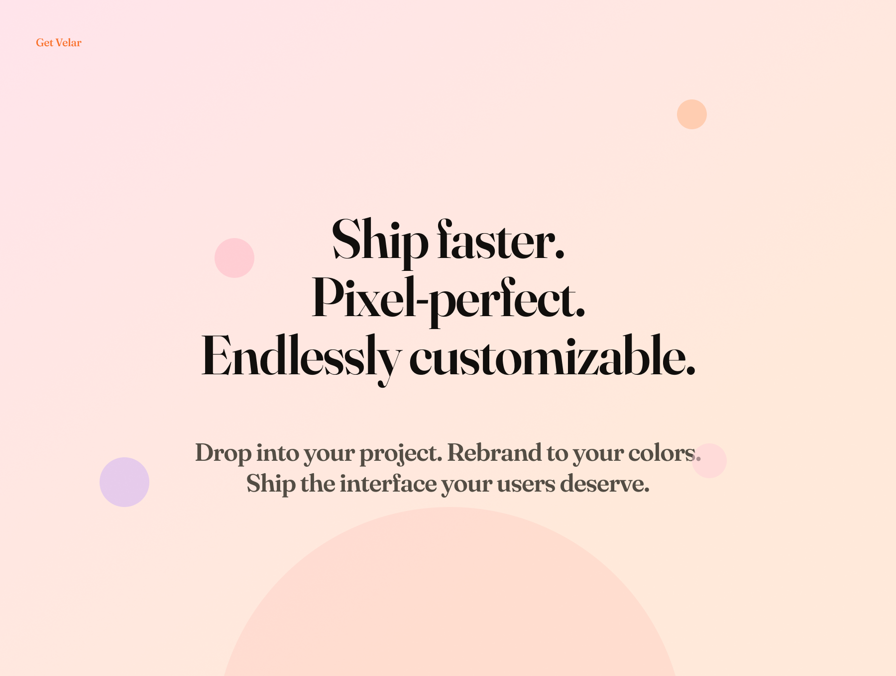
[VIP] Velar: Design System
200+ token-bound components · 8 candy color families · Light, Dark & High Contra.
![[VIP] Velar: Design System](https://i.pinimg.com/1200x/ad/af/0a/adaf0ad541e2355d4301062dfb96e63b.jpg)
Overview
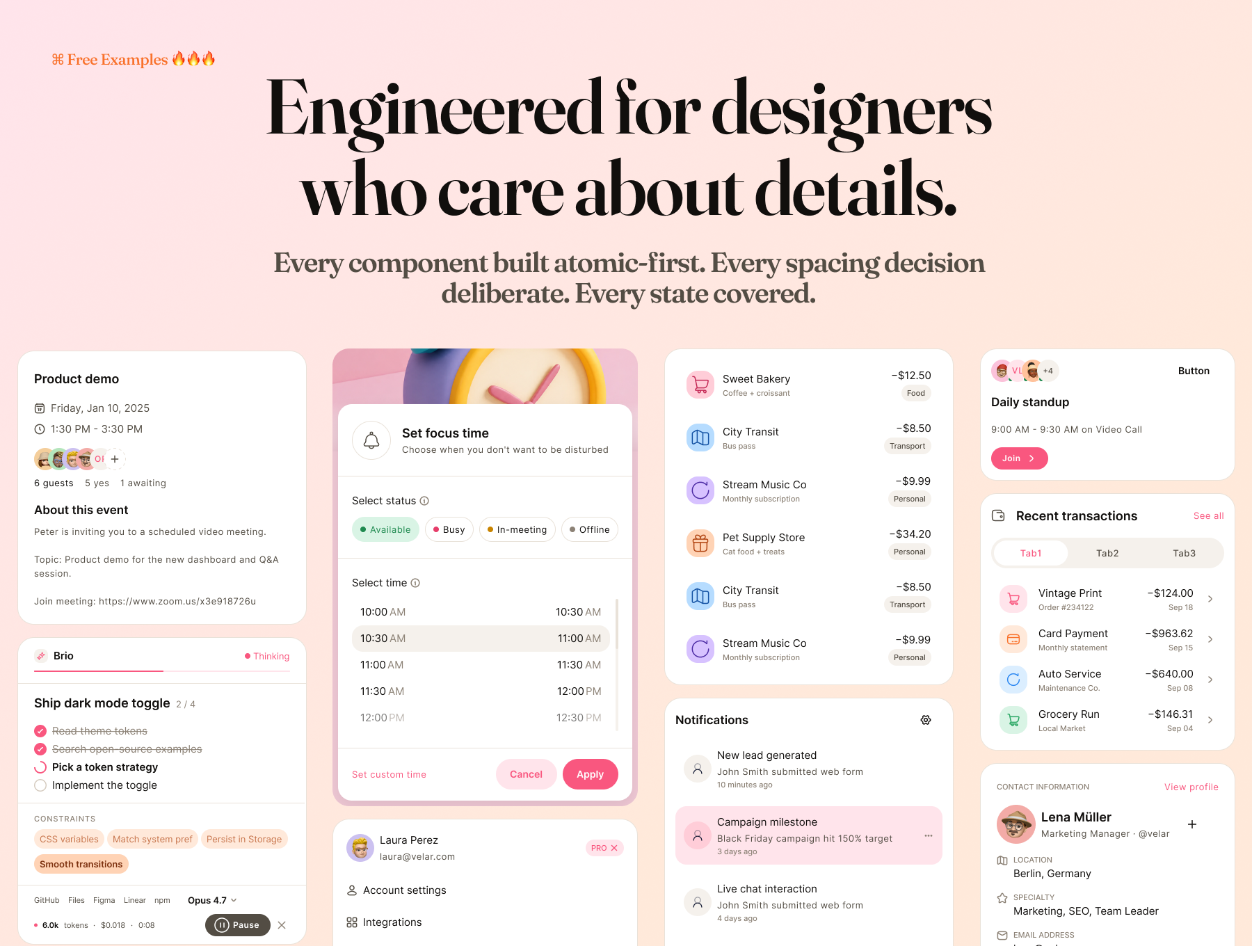
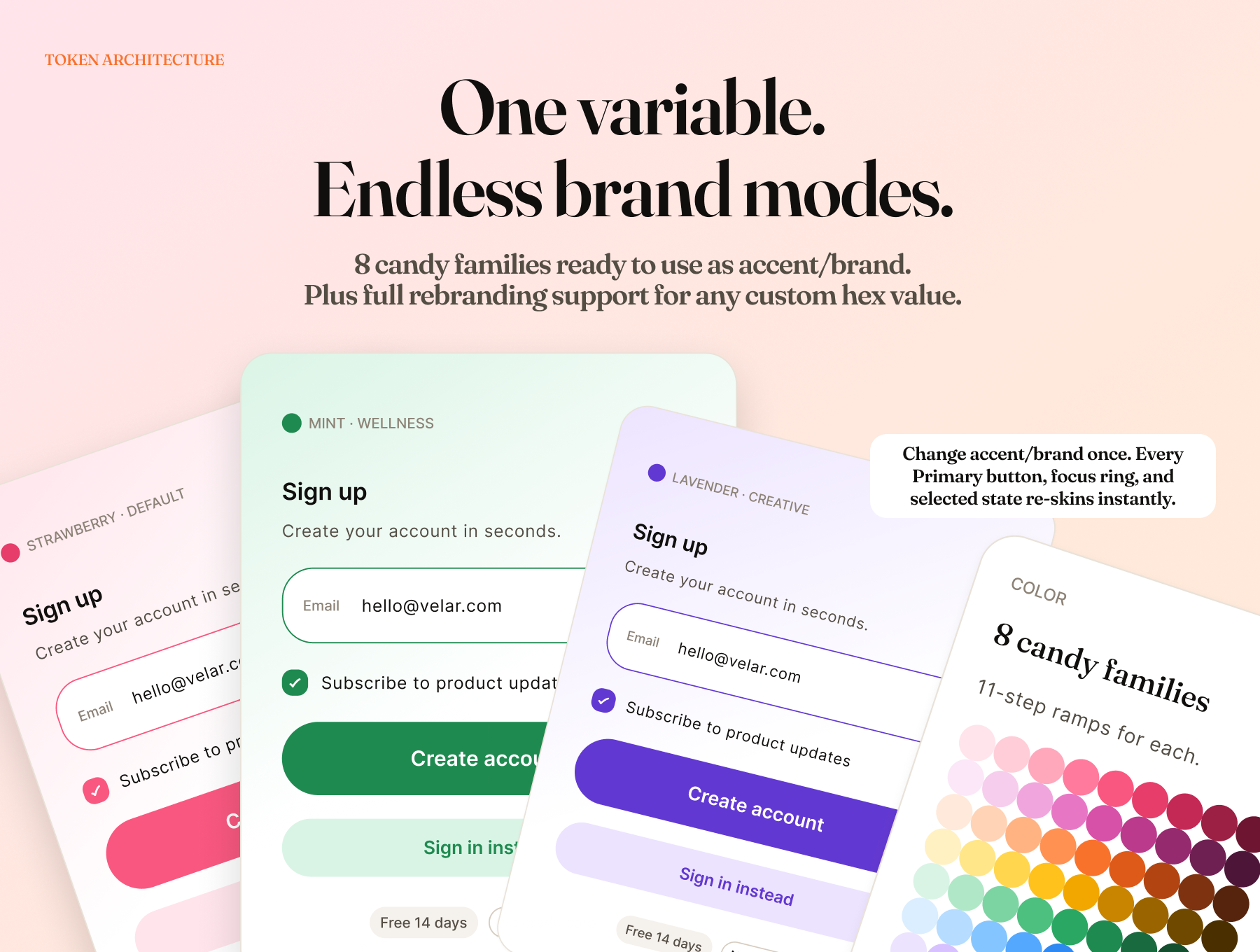
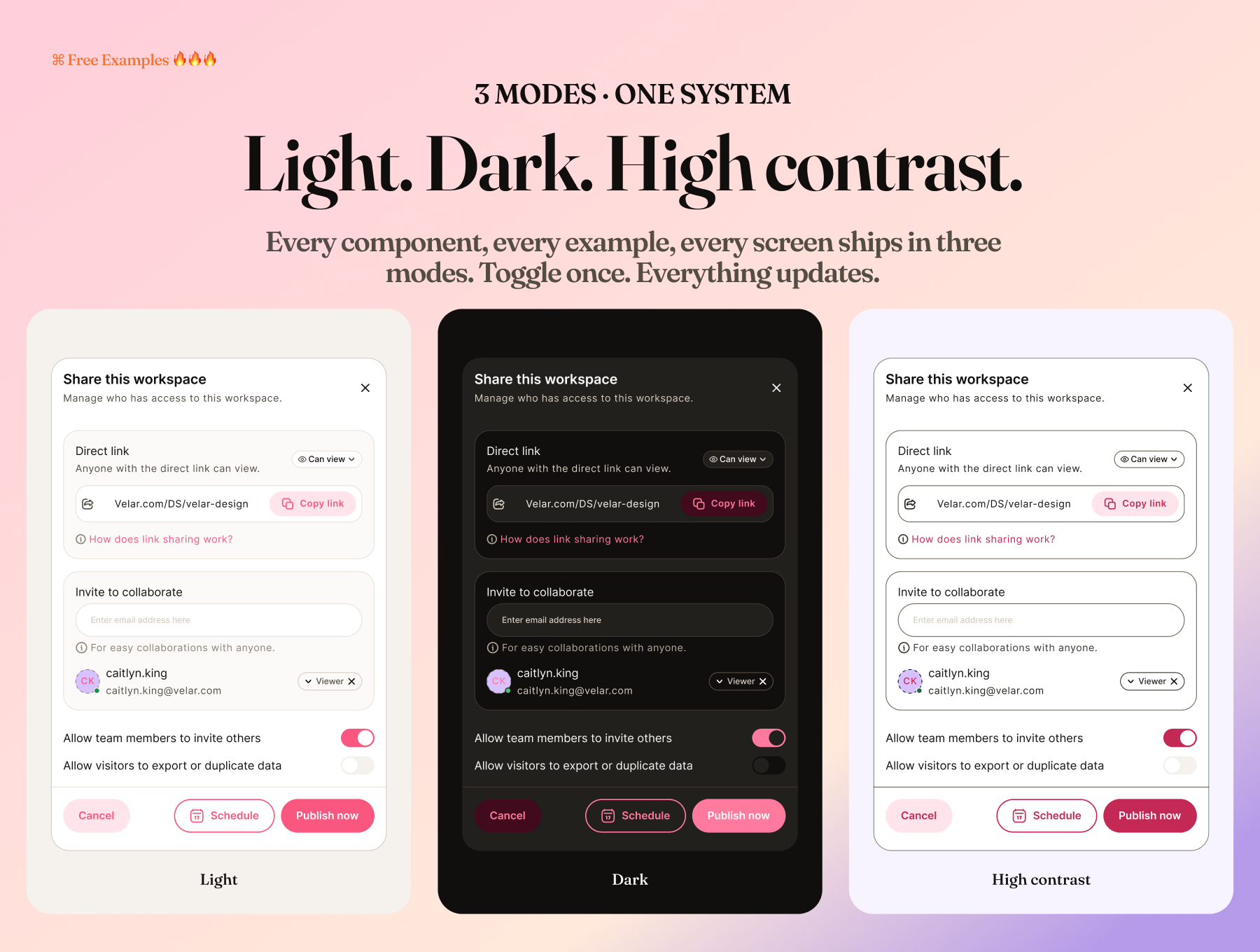
Velar is a complete Figma design system built around a pastel-candy aesthetic — warm, soft, and distinctively modern. Every component is fully token-bound, meaning one variable change rebrands the entire kit instantly. Three themes (Light, Dark, High Contrast) are built in and work at the frame level — no duplication required.
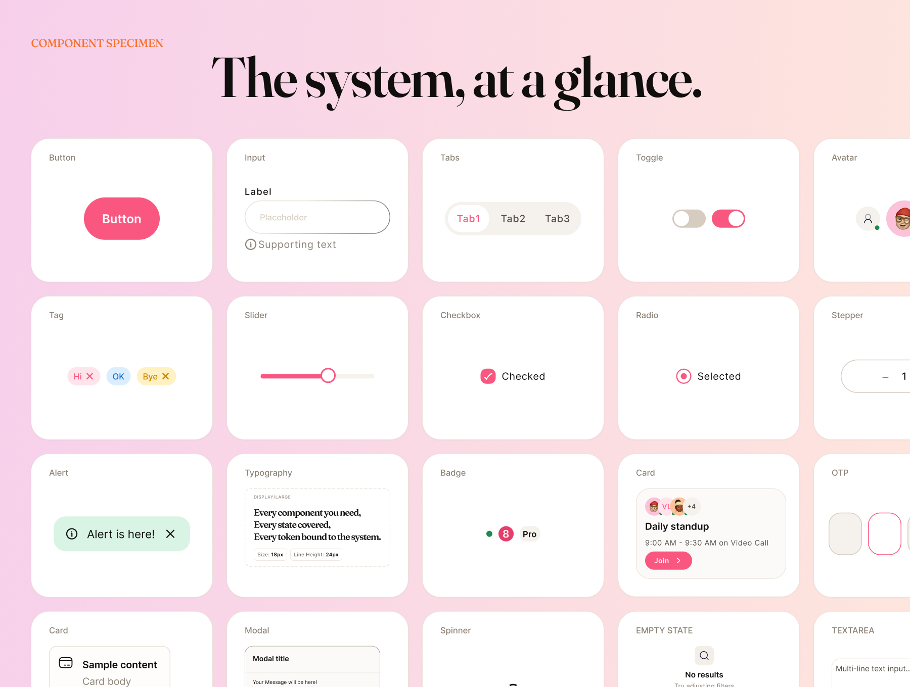
This isn't a component dump. Velar is a system: a three-layer token architecture (Primitives → Semantic → Component), 88 colors across 8 candy families, 13 text styles, 6 elevation shadows, and 200+ components that all speak the same visual language.
WHAT'S INCLUDED
FOUNDATIONS (6 pages)
- Colors — 88 primitive tokens across Strawberry, Bubblegum, Peach, Lemon, Mint, Sky, Lavender, and Cotton. Each family has 11 steps from /50 to /950. WCAG-tested contrast pairings with AAA/AA badges.
- Typography — Fraunces + Inter, configured as a complete type scale with 11 named text styles and 3 control styles.
- Spacing & Layout — Base-4 spacing scale, space/2xs (4px) to space/5xl (96px).
- Radius, Borders & Shadows — 6 named radius tokens, border tokens, and 6 elevation shadow styles.
- Iconography — 80+ stroke-only icons at 24px, 1.5px weight, built on Hugeicons. Every icon recolorable via stroke override.
- Illustrations — Soft gradient placeholders sized for easy custom illustration swap-in.
COMPONENTS (22 pages, 200+ variants)
- Buttons — Primary, Secondary, Tertiary, Ghost, Destructive. 3 sizes, full state coverage (Default, Hover, Pressed, Focused, Disabled, Loading). Leading and trailing icon support.
- Input — 3 sizes. Default, Focus, Filled, Disabled, Error states. Label, hint, required asterisk, leading icon, trailing action.
- Textarea — Multi-line input with full state system.
- Select — Closed trigger + Select/Option sub-component for open menu.
- File upload — 5-state lifecycle: Empty, Hover, Uploading, Uploaded, Error. Drag-and-drop and click-to-browse.
- Checkbox — Default, Hover, Checked, Indeterminate, Disabled.
- Radio — Default, Hover, Selected, Disabled.
- Switch — On, Off, Disabled.
- Accordion — Default, Hover, Expanded, Disabled.
- Lists — Composable rows with leading/trailing slots. One-line, two-line, three-line variants.
- Tab bar — Mobile bottom navigation, 4-5 tabs.
- Segmented control — Inline tab control for 2-4 options.
- Modals & Sheets — 3 modal sizes (Sm/Md/Lg), Bottom sheet with handle bar, Left/Right side sheets with asymmetric radius.
- Toast — 20 variants. 5 semantic colors × show/hide action × dismiss.
- Banner — 20 variants. Persistent page-level messages with action and dismiss controls.
- Alerts — 36 variants. Inline and Stacked types, Subtle/Solid/Stroke styles, 5 semantic colors.
- Tag — 63 variants. 4 styles (Subtle, Solid, Stroke, Ghost) with optional leading icon and trailing dismiss.
- Badge — 18 variants. Dot, Count, and Label types.
- Avatar — 24 variants with status indicator as component property.
- Empty & Error States — No Items, No Results, No Permission, Network Error.
- Misc & Utility — Slider, Stepper, OTP, Divider, Skeleton, Spinner.
- Examples — 30+ real-world product screens built from Velar components.
TOKEN SYSTEM
- 3-layer architecture: Primitives → Semantic → Component
- Semantic/Theme collection with Light, Dark, and High Contrast modes
- Semantic/Brand collection for full rebrand in one variable swap
- Rebrand the entire kit by editing 5 accent/* tokens — every button, input, checkbox, switch, badge, and accent surface updates instantly
- Frame-level mode override — show a dark card inside a light page without duplicating anything
WHO IT'S FOR
- Velar is built for intermediate to advanced Figma designers who want a kit that's architecturally sound, not just visually pretty. If you care about token systems, scalable component structures, and a kit that actually holds up in production handoff — this is for you.
WHAT'S NOT INCLUDED
- Mobile device frames (iOS/Android) — Velar is component-focused, not template-focused
- Animated prototypes
- Code export or developer tokens file (components are Figma assets)
FONTS REQUIRED
- Fraunces — free on Google Fonts fonts.google.com/specimen/Fraunces
- Inter — free on Google Fonts fonts.google.com/specimen/Inter
FILE DETAILS
- Format: Figma file (.fig)
- Requires: Figma Professional or above (for variable support)
Highlights
- design system
- figma ui kit
- mobile & Web
- components
- tokens & variables
- pastel, candy, dark mode
What's Your Reaction?
 Like
0
Like
0
 Dislike
0
Dislike
0
 Love
0
Love
0
 Funny
0
Funny
0
 Angry
0
Angry
0
 Sad
0
Sad
0
 Wow
0
Wow
0
![[VIP] Vesto: Stock Investment Mobile](https://i.pinimg.com/1200x/e2/41/74/e24174a3f863e4229588794e40e6701e.jpg)
![[VIP] AI Community Learning](https://i.pinimg.com/1200x/5f/1b/1d/5f1b1daa401550eea934cf277dddf6b0.jpg)
![[VIP] Renewable Energy Cards](https://i.pinimg.com/1200x/d6/f1/48/d6f148dec70117828ec896bb46c10f55.jpg)
![[VIP] Averra Living: Luxury Villa Booking](https://i.pinimg.com/1200x/28/7c/61/287c6118e0838b198968606dffd9b10a.jpg)


