

[VIP] Node-based AI system UI kit
A Figma UI kit for node-based AI products – with the React + TypeScript frontend.

Overview
BUILD AI WORKFLOW PRODUCTS WITHOUT STARTING FROM A BLANK CANVAS
Nodeflow is a complete design system for node-based AI tools: flow builders, agent platforms, and automation dashboards. Not a screenshot pack. Every surface is a real component with variants, Auto Layout, and variable-bound tokens—and the frontend code ships with it.
Live Preview: nodeflow.george-aziz.com
WHAT'S INSIDE
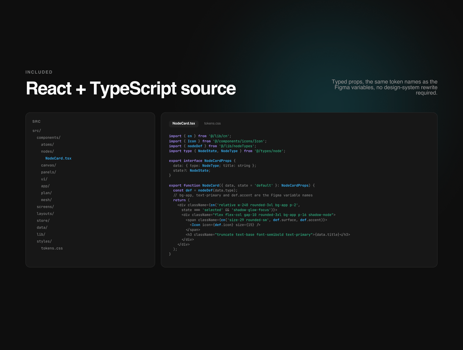
React + TypeScript sourceThe components ship as code, not just artboards. Typed props mirror the Figma variant axes: a Node Card’s type and state share the exact same values and token names in both Figma and React, eliminating design-system rewrites between handoff and build.
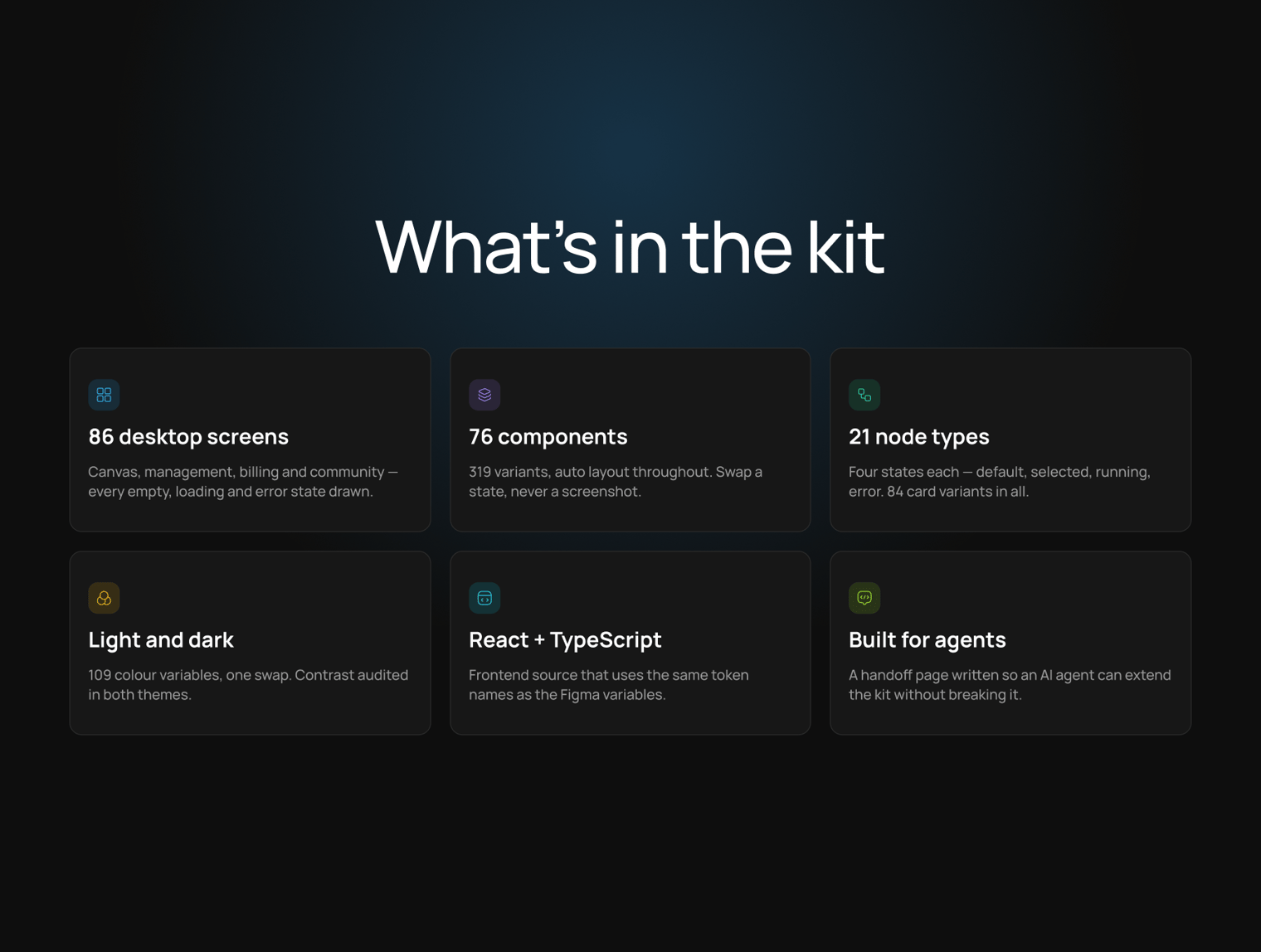
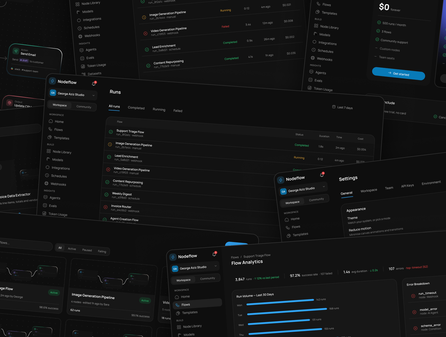
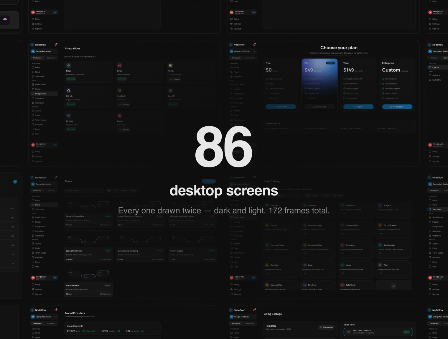
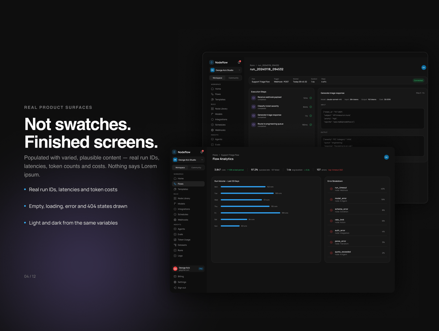
86 desktop screens Canvas and editor, auth and onboarding, app settings and management, plans and billing, community marketplace, and analytics. Empty, loading, error, and 404 states are fully designed—not just the happy path. Every screen connects directly to product navigation; there are zero orphan artboards.
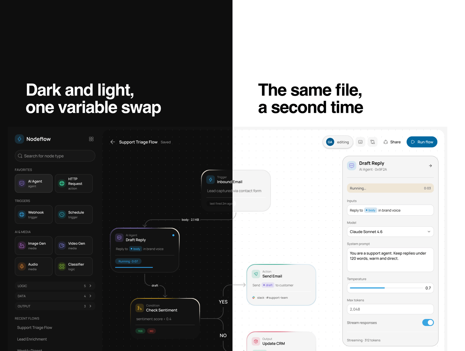
86 screens in light modeNot a hand-restyled duplicate. Built with a single variable swap, contrast-audited in both modes. 172 frames in total.
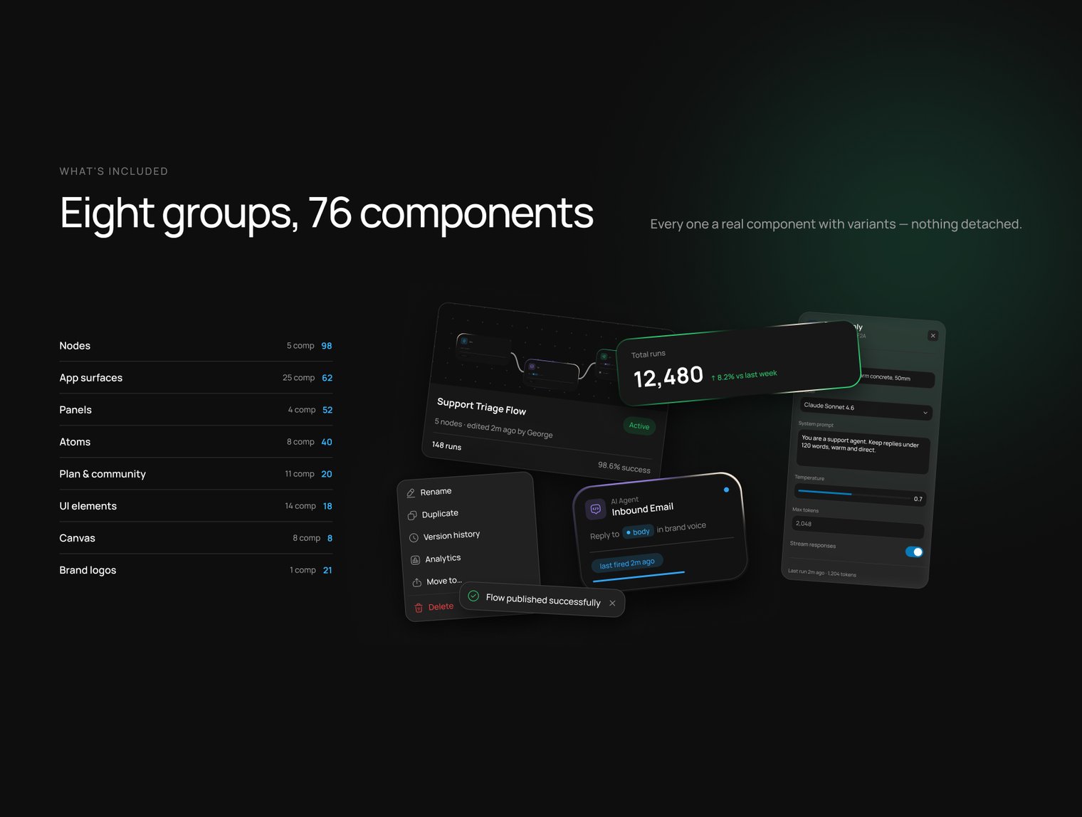
76 components · 319 variants Node Card, Inspector Panel, Nav Rail, Sidebar, Toolbar, Flow List Row, Table Row, Community Card, Plan Card, Metric, Page Header, and more. Auto Layout applied throughout.
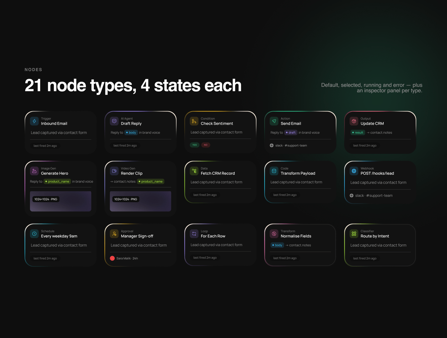
21 node types × 4 states Trigger, AI Agent, Condition, Action, Output, Image Gen, Video Gen, Data, Code, Webhook, Schedule, Approval, Loop, Merge, Delay, Transform, Audio, Classifier, Subflow, Error Handler, Agent Build—each with default, selected, running, and error states. 84 Node Card variants in total.
217 variables, nothing hardcoded 109 colors with Dark/Light modes, 84 typography variables, 15 spacing tokens, and 9 radius tokens. Every color ships as a semantic pair (the element color alongside a pre-blended background partner) so tints never break when switching themes. Every text layer is bound to family, weight, and size variables.
Built to be extendedIncludes a comprehensive handoff guide documenting token conventions, component recipes, and edge cases—clear enough for a designer, engineer, or AI agent to extend the kit without breaking consistency.
WHO IT'S FOR
- Founders and designers building AI agent platforms, workflow automation engines, LLM orchestration dashboards, or any product with a node-based canvas at its core.
WHAT YOU GET
- One Figma file across 18 organized pages
- Complete React + TypeScript component library
Highlights
- 86 desktop screens
- 76 components, 319 variants
- 21 node types, 4 states each
- Light and dark from one variable set
- Frontend code ready — React + TypeScript
- AI-compatible design
What's Your Reaction?
 Like
1
 Dislike
0
 Love
1
 Funny
0
 Wow
1
 Sad
0
 Angry
0


Comments (0)