

[Ultra] HeroUI Pro: Web Hero + Ship faster
Premium composable components that extend HeroUI – built for teams who want to ship beautiful, production-ready apps fast.

HeroUI Pro is a premium extension of HeroUI OSS — production-ready, fully composable components that follow the same patterns you already know from HeroUI OSS. New components, themes, and fixes ship regularly as package updates.
What's Included
- 65+ React components with 477+ examples — Command Palette, Data Grid, Sheet, Sidebar, Emoji Picker, Charts, File Tree, KPI cards, and more — each with full documentation
- AI components — A complete set of chat primitives for conversations, messages, prompt inputs, attachments, sources, tool calls, reasoning traces, markdown, and code blocks
- React Native components — The same design system with a similar API across iOS and Android
- Templates — Production-ready dashboards, mail, chat, and finance apps
- Premium themes — Brutalism, Glass, and more. Switch aesthetics in one import.
- Design Systems — Create custom themes visually, preview live in the docs, and export the CSS
- Figma — Design files for all Pro components + a theme variables sync plugin
- AI tooling — MCP server, agent skills, and design taste for AI-assisted development
- Priority support — Fast support, prioritized issues, private Discord, and a VIP badge
- Teams & Enterprise — Shared themes, centralized billing, SSO, and dedicated support
Next Steps
- Installation — Set up HeroUI Pro in your project
- Browse Components — See all available Pro components
- Design Systems — Create your own custom theme
Acknowledgements
Built on React Aria Components, Tailwind CSS v4, Motion, Recharts, Number Flow, and Gravity UI Icons.
Ship faster with beautiful components
Explore a collection of over 180+ beautiful and responsive components, professionally created by the team behind NextUI.
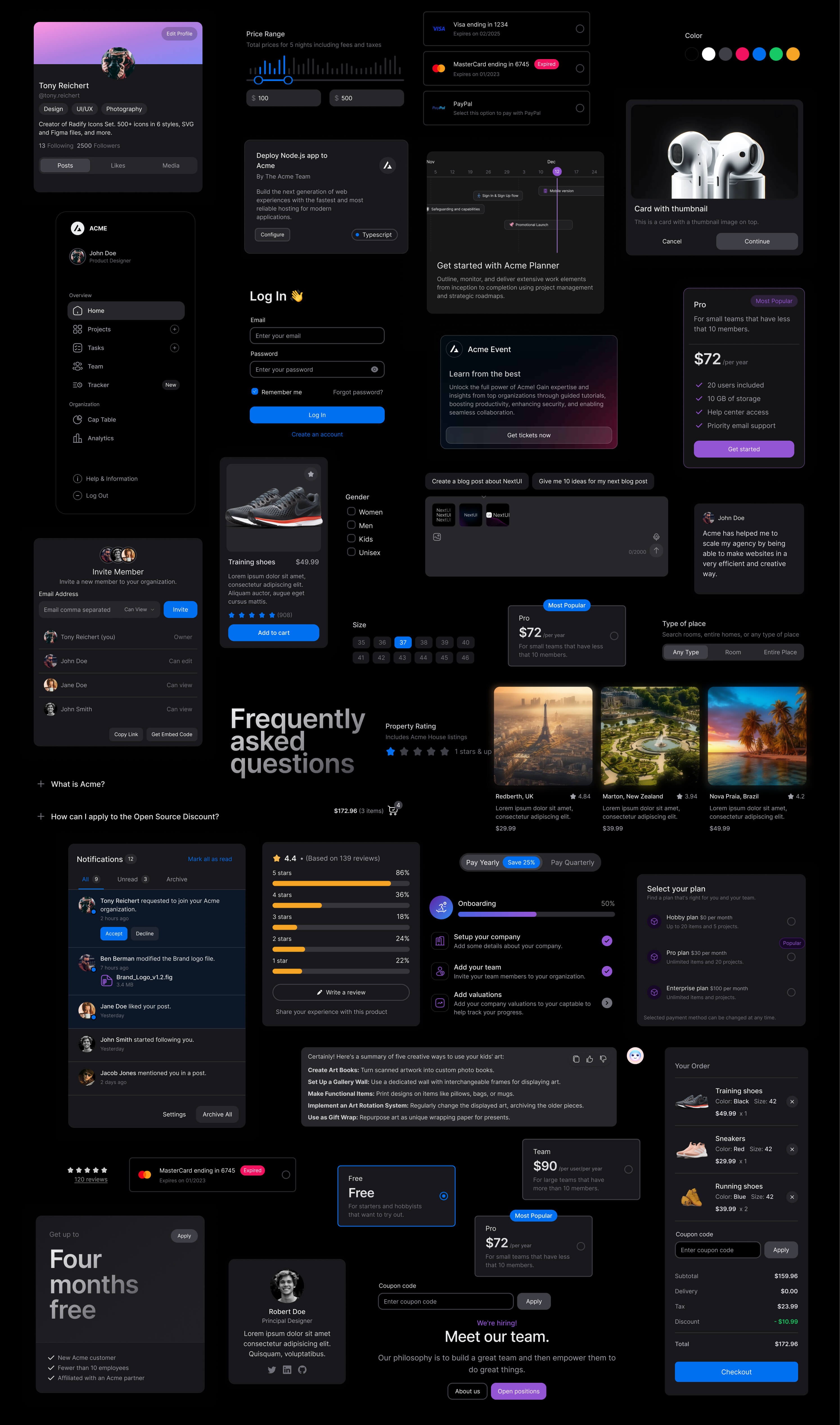
Make beautiful websites regardless of your design experience.
Beautiful, fast and modern React UI library.
- Themeable
Provides a plugin to customize default themes, you can change all semantic tokens or create an entire new theme.
- Fast
Built on top of Tailwind CSS, which means no runtime styles, and no unnecessary classes in your bundle.
- Light & Dark UI
Automatic dark mode recognition, NextUI automatically changes the theme when detects HTML theme prop changes.
- Unique DX
NextUI is fully-typed to minimize the learning curve, and provide the best possible developer experience.
Apply your own theming decisions.
NextUI provides a custom TailwindCSS plugin that allows you to customize the default themes or create your own.
Accessibility out of the box.
NextUI components are built on top of React Aria ensuring exceptional accessibility support as a top priority.
- Keyboard navigation
- Managed focus
- Collision aware
- Alignment control
- Screen reader support
- Typehead support
Dark mode is effortless.
NextUI comes with a fully well-scaled default dark theme that you can apply to your application with just adding the dark attribute to your html.
Customization made easy.
NextUI is based on Tailwind Variants, it simplifies component slots customization while avoiding Tailwind class conflicts.
What's Your Reaction?
 Like
3
 Dislike
0
 Love
1
 Funny
0
 Wow
1
 Sad
0
 Angry
0


Comments (0)